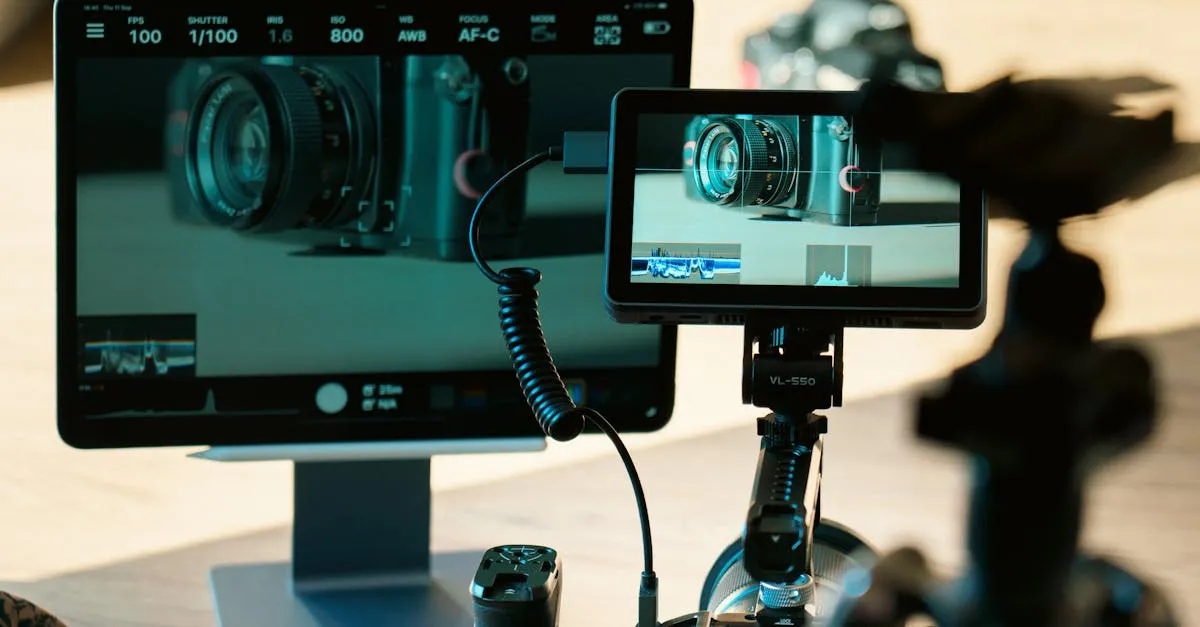
Understanding Scopes: Waveform, Vectorscope, and Histogram
Your eyes are terrible at color grading. That sounds harsh, but it is a fact you need to accept if you want to produce professional drone footage.
By the time you sit down to edit, your eyes have already betrayed you. You might be editing in a bright room, your monitor might have the wrong color temperature, or maybe you have just been staring at a screen for six hours. Monitor calibration, room lighting, and eye fatigue all drastically affect your perception.
Scopes never lie.
Scopes are graphical representations of the actual data inside your video files. They do not care about your room lighting or how tired you are. They tell you objectively what is happening in your footage. If you ignore them, you are just guessing.
Where to find them:
- DaVinci Resolve: Open the Color page, scopes are in the top right by default
- Premiere Pro: Open the Lumetri Color panel, then click the Lumetri Scopes button
- Final Cut Pro X: Go to View and click “Show Video Scopes”
The Waveform Monitor
The Waveform is the most important scope. Think of it as a map of your image’s brightness from left to right. The horizontal axis matches the horizontal axis of your frame. The left side of the waveform represents the left side of your video, and so on.
The vertical axis represents brightness, measured on a scale from 0 to 100. Zero is absolute black. One hundred is broadcast-safe white.
Reading a waveform is straightforward. If your drone footage shows a dark forest on the left and a bright sky on the right, you will see a cluster of data sitting low on the left side of the scope, and a spike pushing high on the right side.
The danger zones are above 100 and below 0. If your signal goes above 100, your highlights are clipped. If it drops below 0, your shadows are crushed. In both cases, the actual pixel data is destroyed. You cannot get it back, no matter how much you tweak the sliders.
You fly your drone over a mountain range at noon. Looking at your monitor, the bright blue sky looks perfectly fine. But you pull up your waveform and see a massive spike sitting at 105. Your eyes lied to you. That sky is completely clipped. All the subtle gradient details in the clouds are gone forever, replaced by a flat block of solid blue.
The RGB Parade
The RGB Parade is the same concept as the standard waveform, but instead of showing overall brightness (luma), it splits the signal into three separate graphs: Red, Green, and Blue, sitting side by side.
Why does this matter? It is the best way to spot color casts in your footage. In a perfectly neutral image, the Red, Green, and Blue waveforms should line up almost perfectly. This is especially useful for drone pilots because drones frequently shoot through atmospheric haze that introduces a blue shift across the entire frame. Your eyes get used to the blue after a minute of watching, but the RGB parade will instantly show you that the blue channel is sitting higher than red and green across the entire waveform.
You use the RGB parade to balance the image so all three channels match.
The Histogram
You have probably seen a histogram before. It is that little mountain graph on your camera screen. The histogram shows the distribution of tonal values across your entire image. The left side represents shadows, the middle represents midtones, and the right side represents highlights.
Unlike the waveform, the histogram does not care about where the pixels are located in the frame. It just counts them. A pile of dark rocks in the corner of your frame will push the graph to the left exactly the same way as a dark subject sitting in the center.
A good exposure generally has data spread across the entire range without heavy spikes touching the absolute edges. If you see a massive spike slamming against the right wall, you have clipped highlights. If it is slammed against the left wall, you have crushed shadows. The histogram is a great quick-check tool to verify your overall exposure, but because it lacks spatial data, it is less precise than a waveform for actually fixing specific problems.
The Vectorscope
The Vectorscope is where color information lives. It is a circular graph. Right in the dead center is totally desaturated, meaning pure black, pure white, or neutral gray. As you move outward from the center toward the edges, saturation increases.
Scattered around the outside of the circle are little boxes labeled R, G, B, M (Magenta), Y (Yellow), and C (Cyan). These targets show where perfectly saturated primary and secondary colors should fall. There is also a line running from the center toward the yellow/orange area, which represents average skin tone.
When you look at a vectorscope for drone footage, you usually see a big blob of data. If you are grading a sunset shot, that blob will stretch out toward the red and yellow targets. If you are looking at an ocean shot, it will point toward the cyan target.
Do not try to force your footage to perfectly hit those primary color boxes on the vectorscope. Nature rarely produces perfectly saturated broadcast colors. Use the vectorscope to ensure your colors are pointing in the right direction and to check for unwanted color shifts, not to hit exact mathematical targets.
Learning to read scopes feels technical at first. It takes a few editing sessions to stop looking at your video preview and force yourself to look at the graphs. But once it clicks, your grading speed will double. You will stop making random slider adjustments hoping the image looks better. You will look at the RGB parade, see that blue is ten points too high, drop the blue gain, and move on.
Stop guessing. Trust the data.